Suffolk University Undergraduate Admission Viewbook
ENROLLMENT CAMPAIGN AND BROCHURE
FOUNDATION & RESEARCH
Suffolk University Office of Undergraduate Admission was looking for a fresh look and feel for their 2026-2027 enrollment materials, starting with the Viewbook. From prospective student recruitment, to the application process, admission, deposit and arrival on campus, they needed a suite of materials that felt urban, boundless, and accurately representative of the student experience on campus. The refreshed look also needed to operate within the existing Suffolk brand guidelines.
THE PROCESS
Our internal process was phased, with each designer working on their own proof of concept based on the research and feedback.
AUDITED EXISTING MATERIALS
Reviewed current assets to identify strengths, gaps, and opportunities.
DEFINED THE SUFFOLK EXPERIENCE
Clarified the emotional and functional core of the institution.
CAPTURED THE STUDENT
Identified key motivations, aspirations, and decision drivers of our students.
EVALUATED BRAND ASSETS
Assessed visual identity, messaging systems, and brand consistency.
COMPETITIVE ANALYSIS
Explored peer institutions and adjacent industries for differentiation and inspiration.
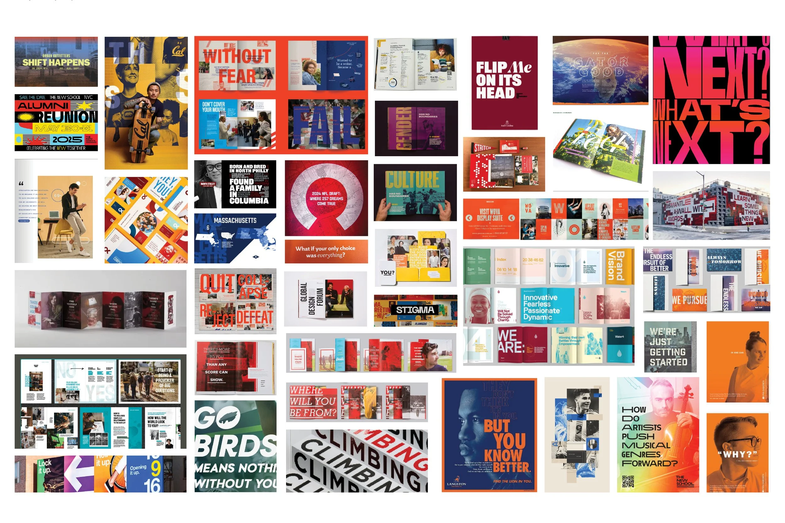
MOODBOARDING & VISUAL EXPLORATION
Established aesthetic territories and strategic creative directions.
DESIGNED POC
Applied concepts across multiple touchpoints to test flexibility & cohesion.
INTEGRATED MESSAGING
Aligned visual systems with core copy themes for a unified brand expression.
PROOF OF CONCEPT
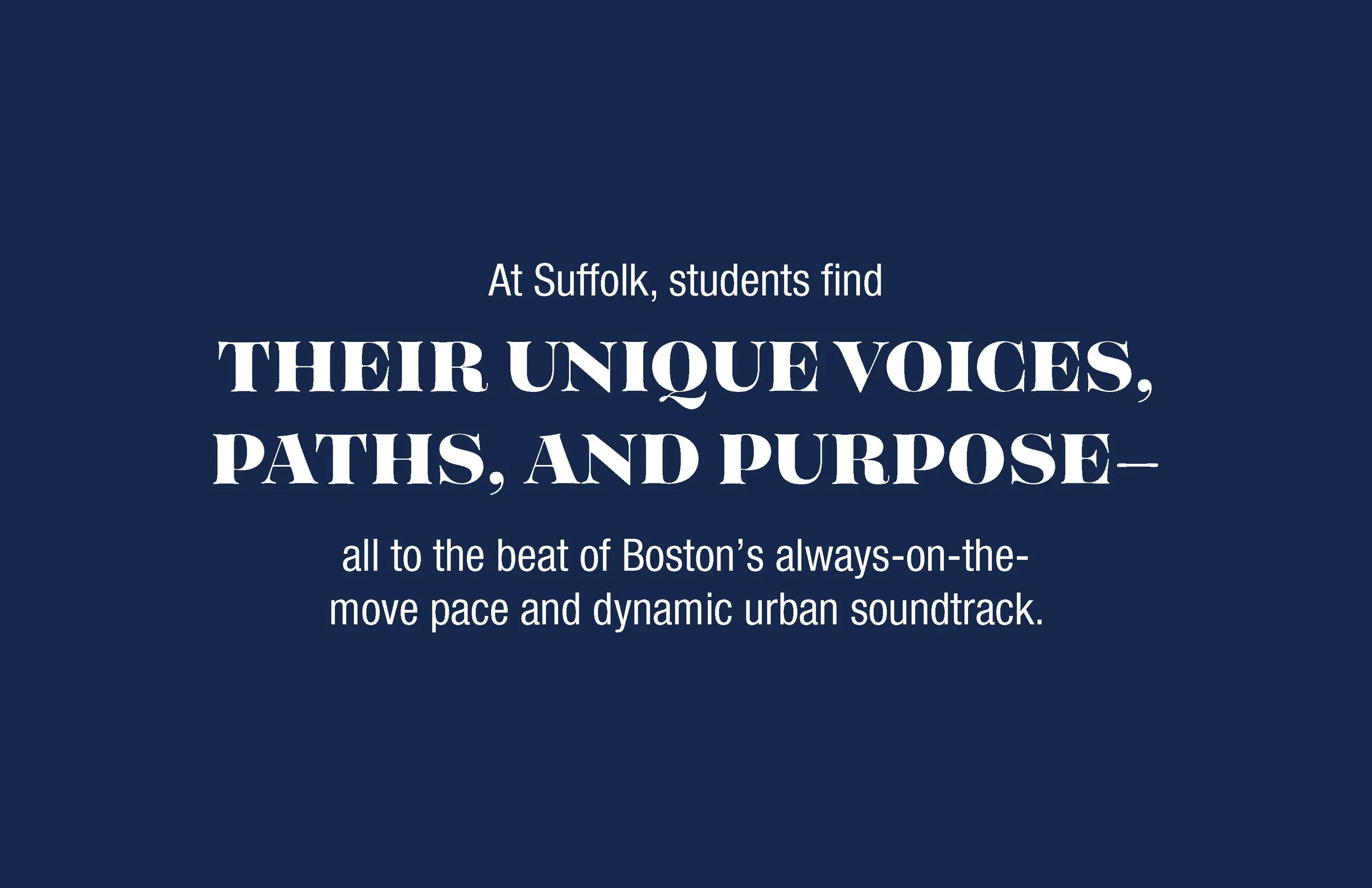
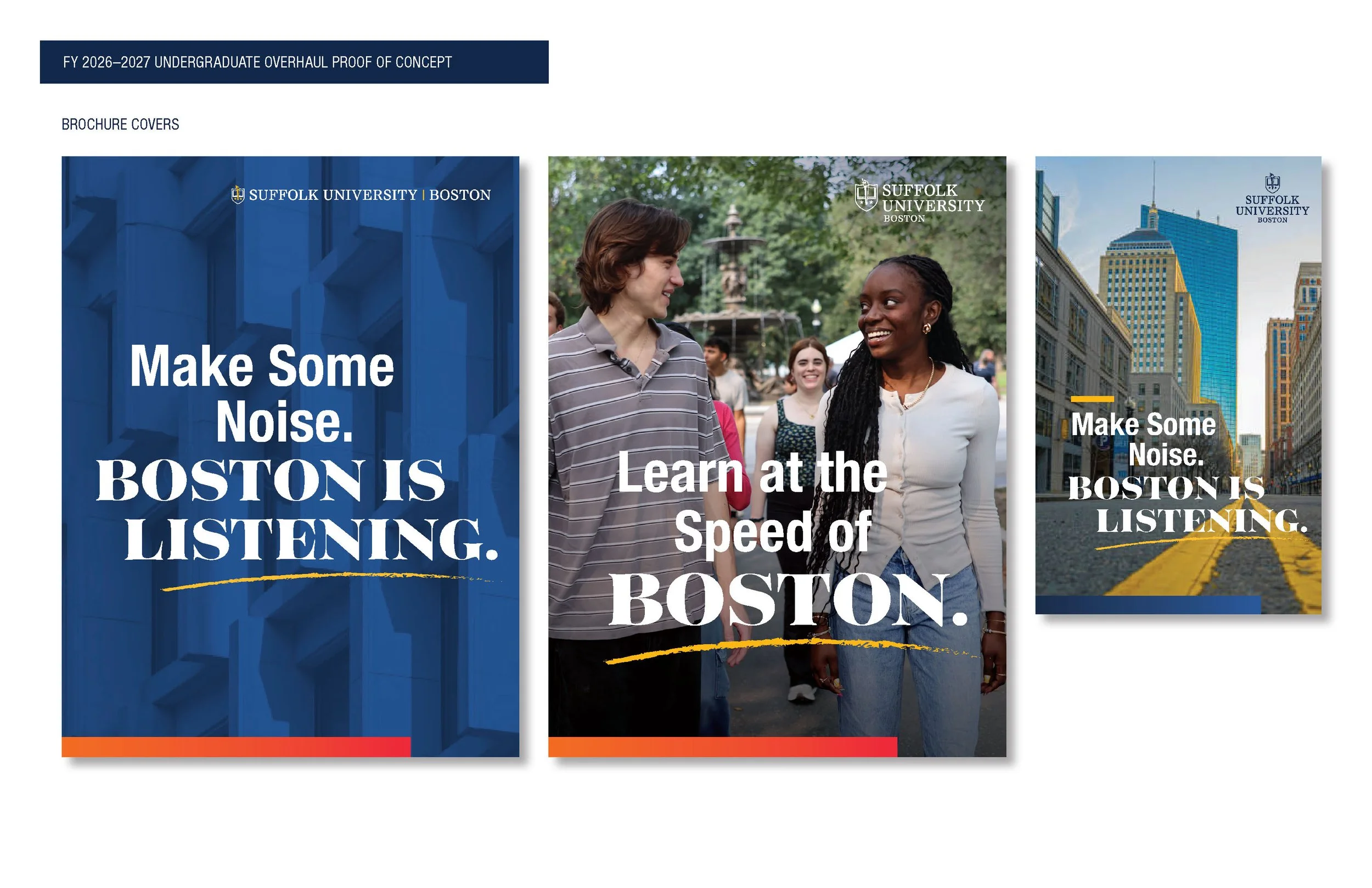
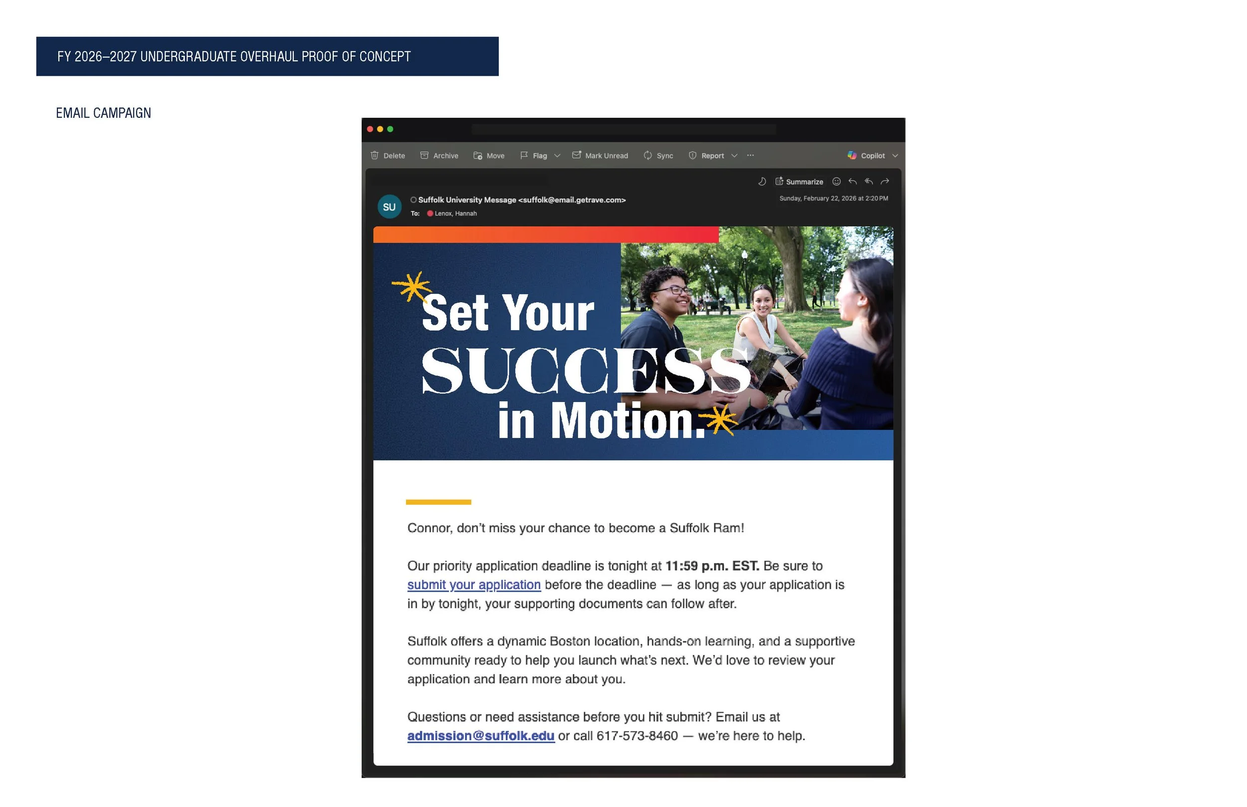
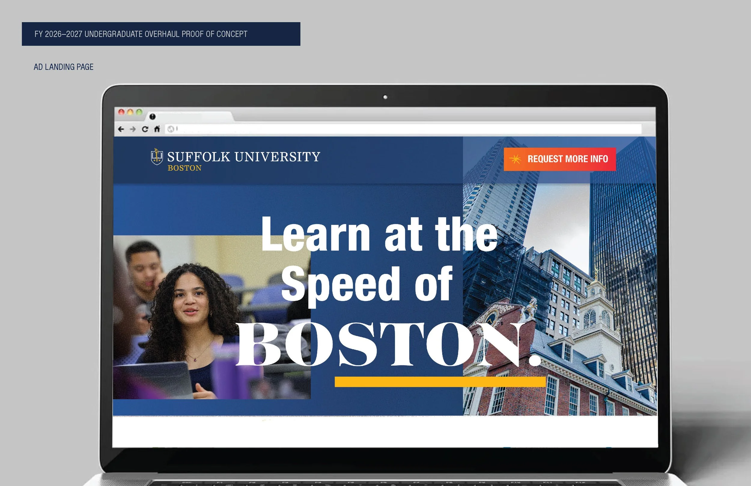
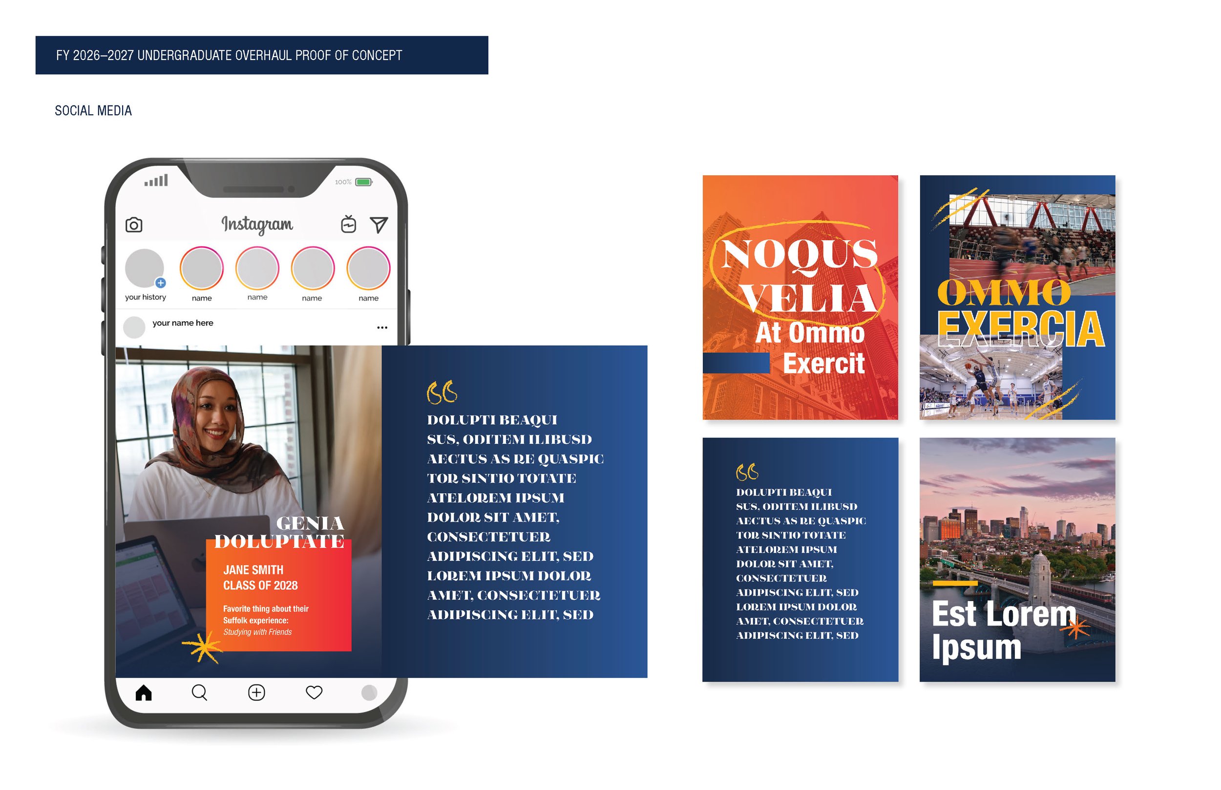
After review with the Admission team and a few rounds of internal review, my proof of concept was chosen. The creative direction pulled on the movement, textures, and sounds of the city in layout, met with the academic and personal rigor of the Suffolk student in creative elements. across operational, financial, and strategic domains.
-
![]()
Positioning
-
![]()
Brochure Covers
-
![]()
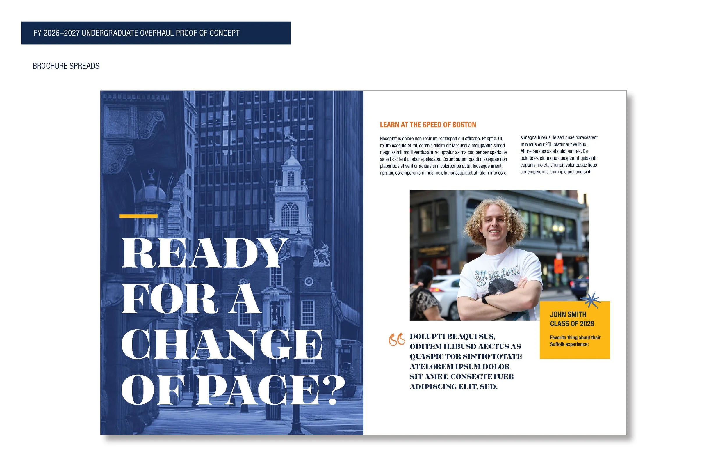
Brochure Spread
-
![]()
Brochure Spread
-
![]()
Brochure Spread
-
![]()
Brochure Spread
-
![]()
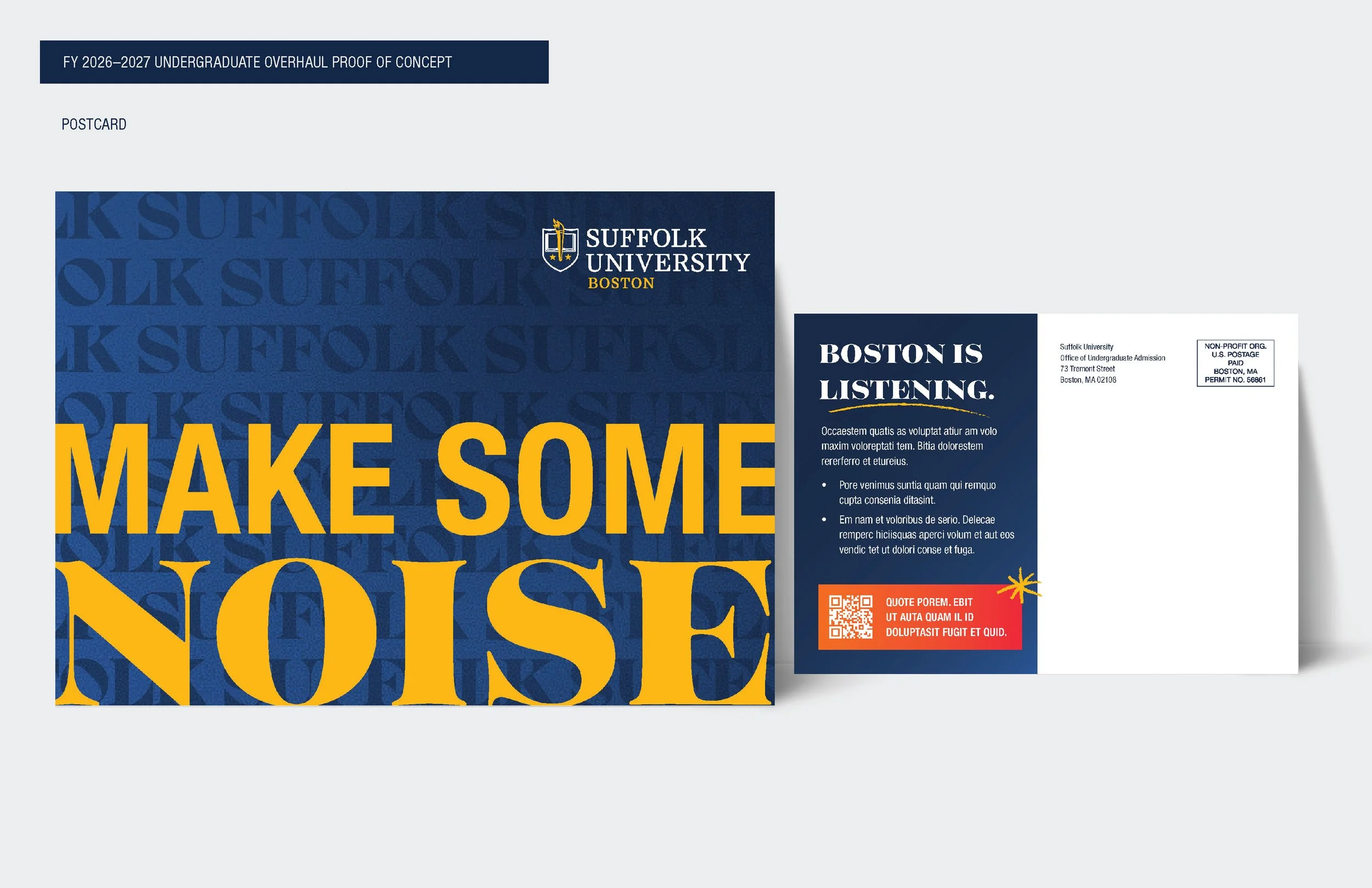
Postcard
-
![]()
Email Header
-
![]()
Ad Landing Page
-
![]()
Social Media
THE VIEWBOOK
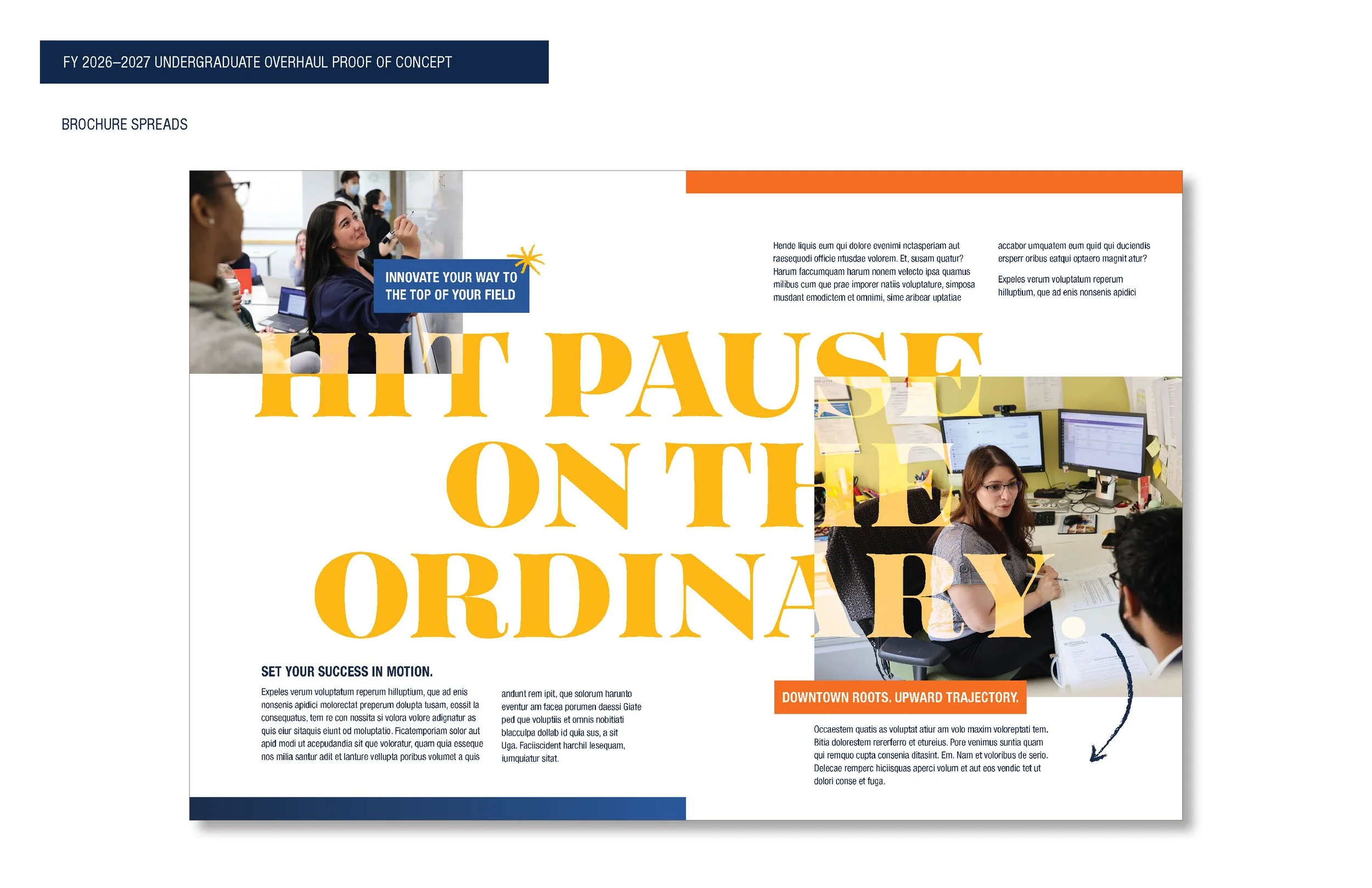
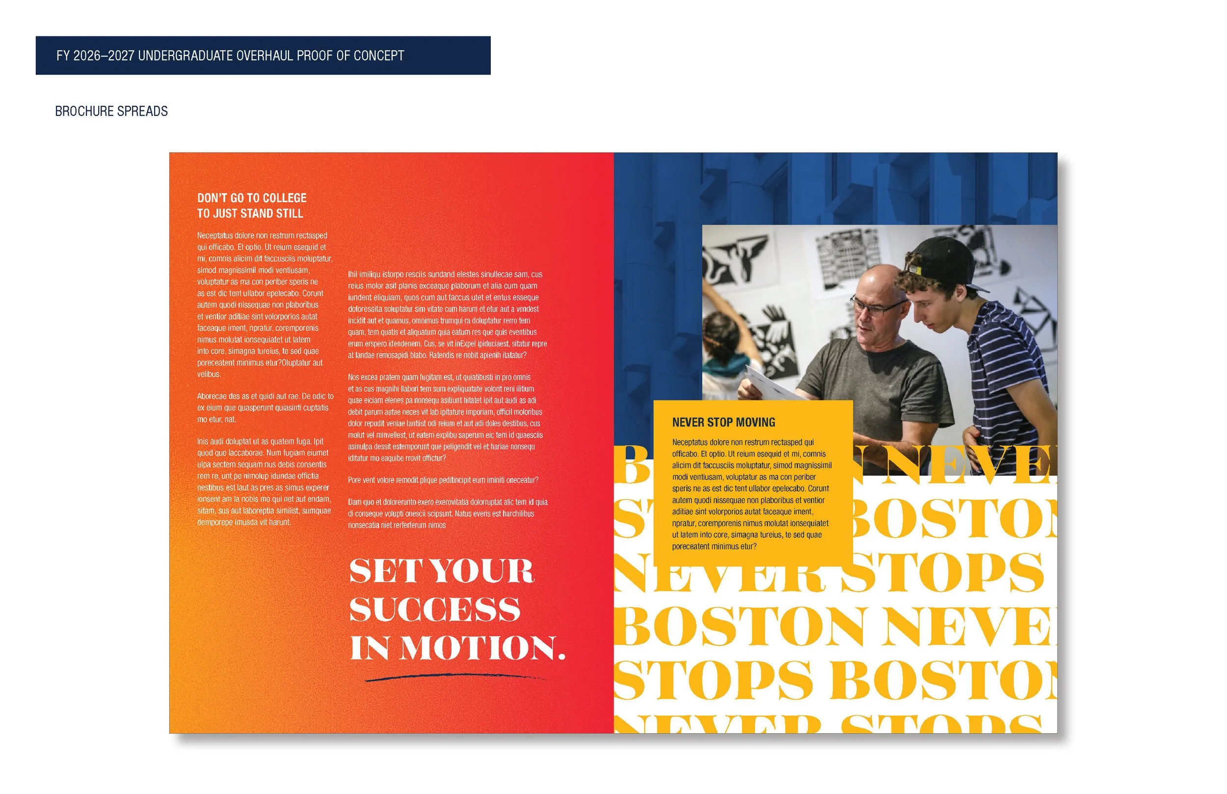
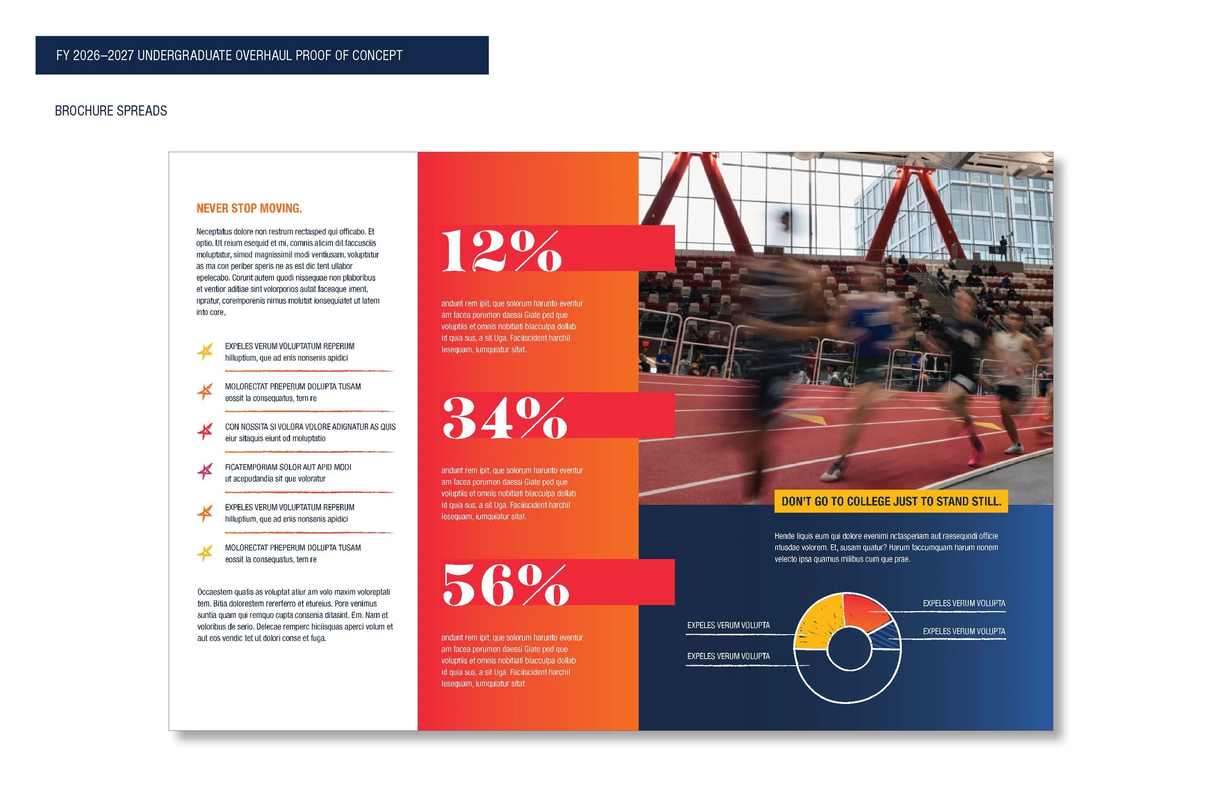
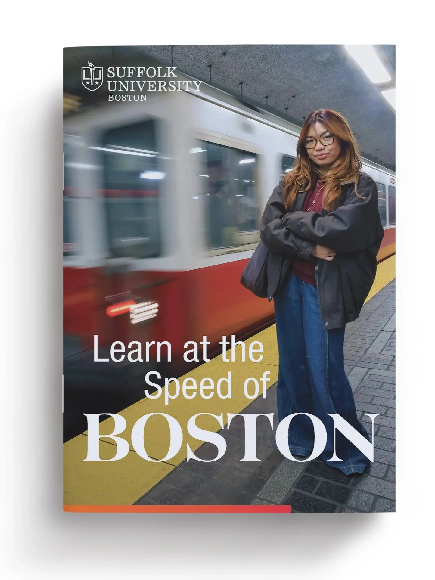
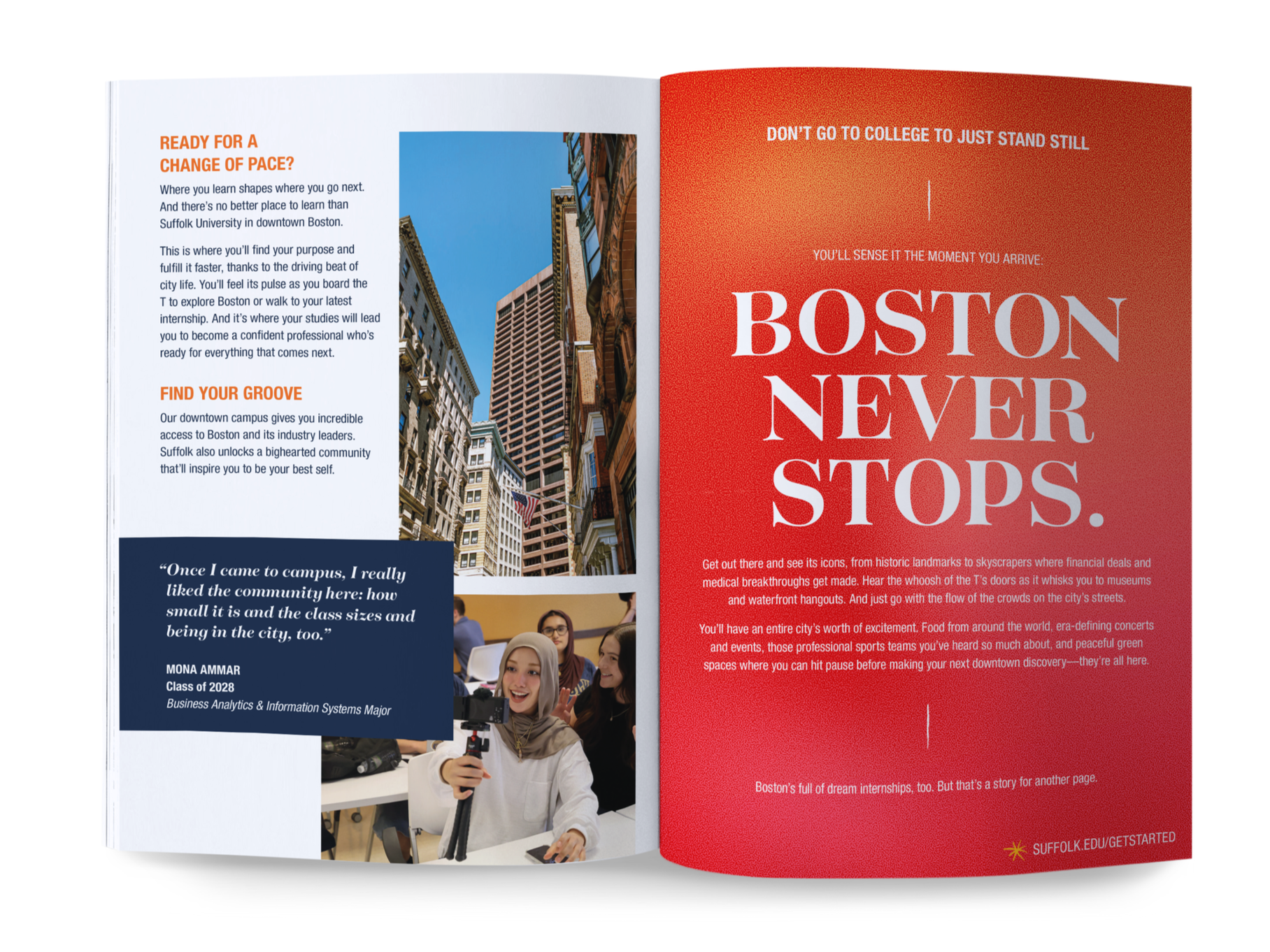
Being the initial touchpoint for the Undergraduate Admission team, the Viewbook set the look and feel for the entire recruitment cycle, and will be used for the next 3-years. It is used as a recruiting material at fairs, mailed to students, and passed out in-person during tours and events. The piece is a 12-Page brochure, with a custom die-cut back pocket to hold 5 bi-fold inserts in cascading sizes. It was designed to be as evergreen as possible, while remaining modular and functional.
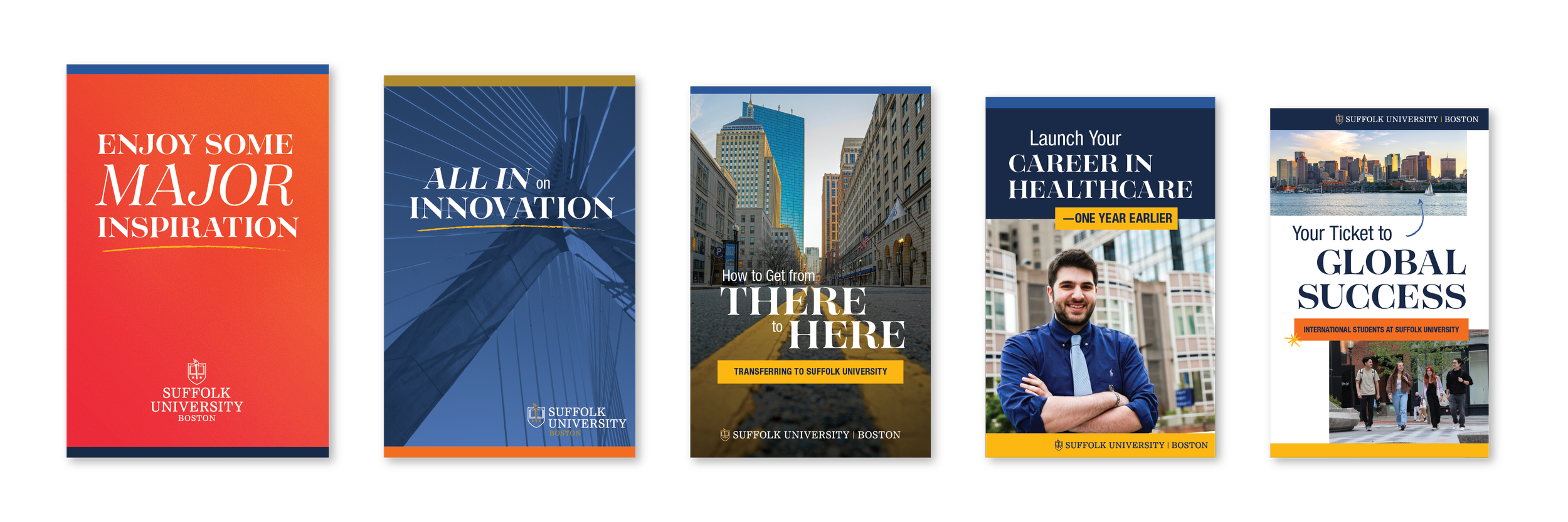
THE VIEWBOOK INSERTS
CONTINUED DEVELOPMENTS
As the cycle continues forward, the new Undergraduate look and feel will be tested and expanded from print into web, video, social, advertising, and event components. Stay tuned!