The Mindful Mentor
BRANDING IDENTITY
FOUNDATION & RESEARCH
As they launched their new business, The Mindful Mentor needed a visual identity to represent their unique offering in the special education advocacy field. The company helps adolescents reach their potential while empowering parents and families with the tools and strategies to support them along the way. Their logo and visual identity needed to feel optimistic, empowering, and approachable, avoiding anything educationally cliché or naïve, and striking a balance between polished and welcoming. I began by gathering inspiration and researching competitors whose aesthetics reflected the client’s taste.
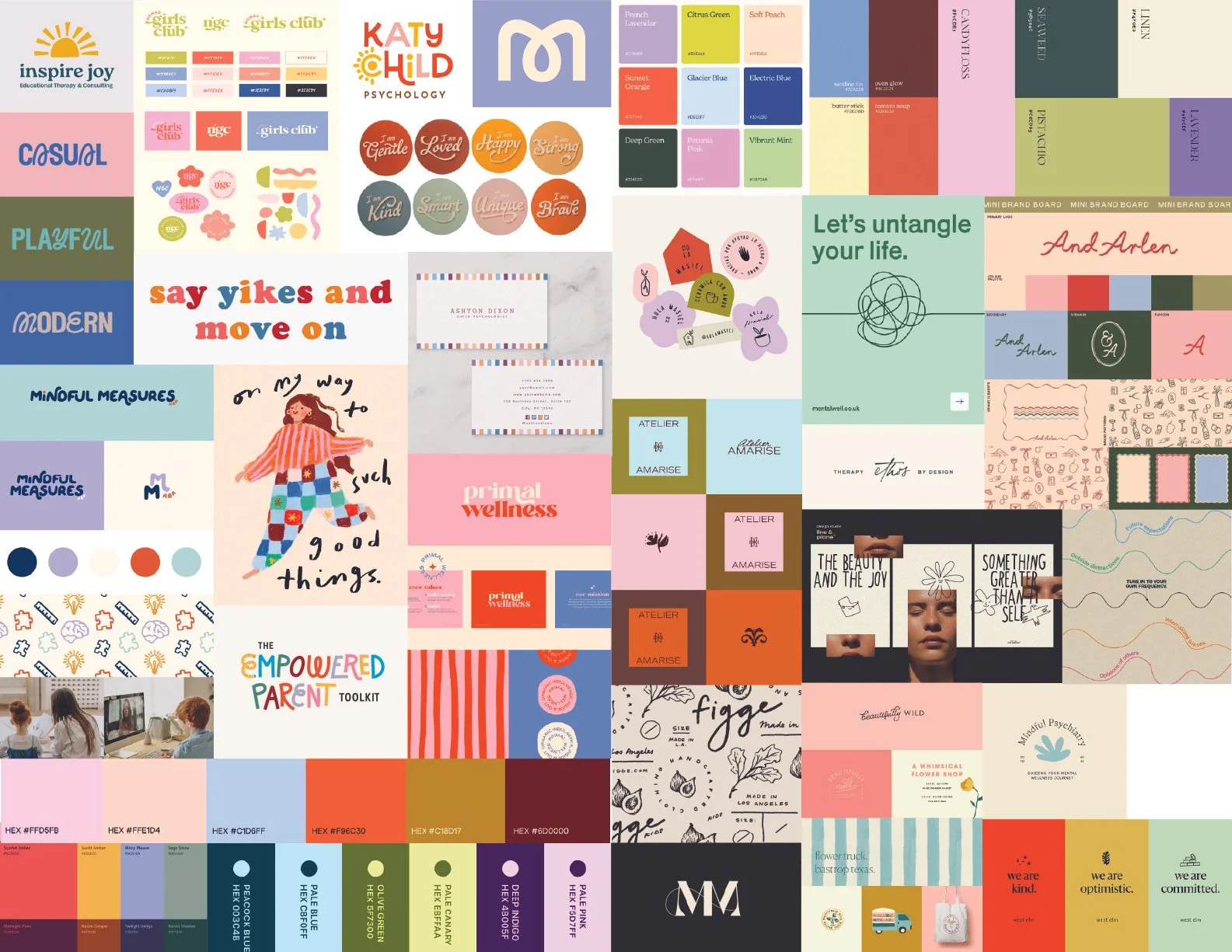
THE OPTIONS
After an initial discovery with the client and deep visual research, I presented the following three directions:
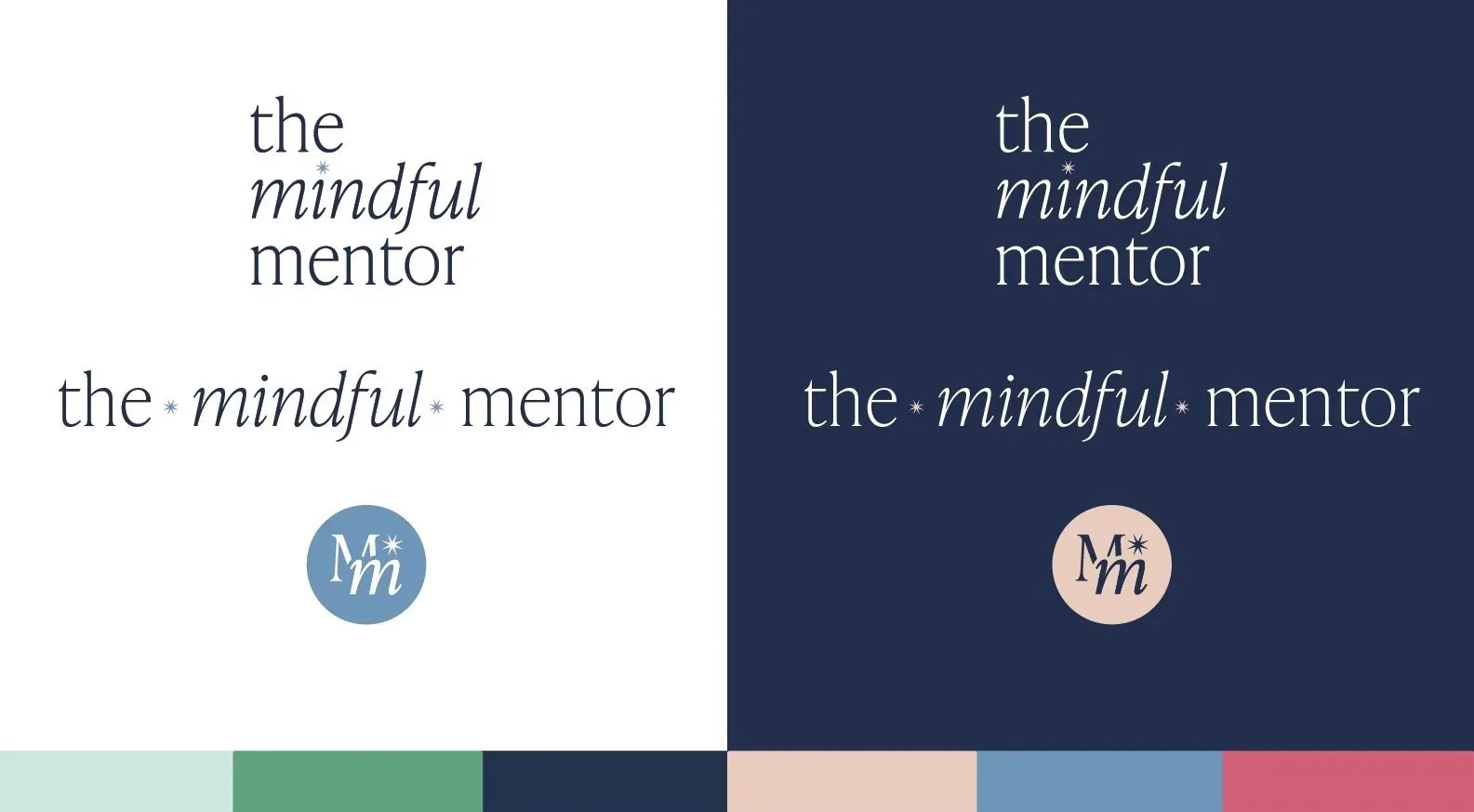
OPTION 1
A thin-line serif that is understated by design, with Mindful set in italics to soften the mark and hint at the warmth behind the brand. The letterforms are unfussy, letting the concept speak quietly.
The icon pairs a large M with a smaller italic M layered over it, capturing the relationship between mentor and client through scale and weight. A small star fills the negative space, adding a touch of feminine charm and acting as a subtle point of connection between the two figures.
The palette leans soft and considered — pistachio greens and bubblegum pink bring a gentle, feminine energy, and a soft blue paired with deep navy pull it back toward polish and depth.
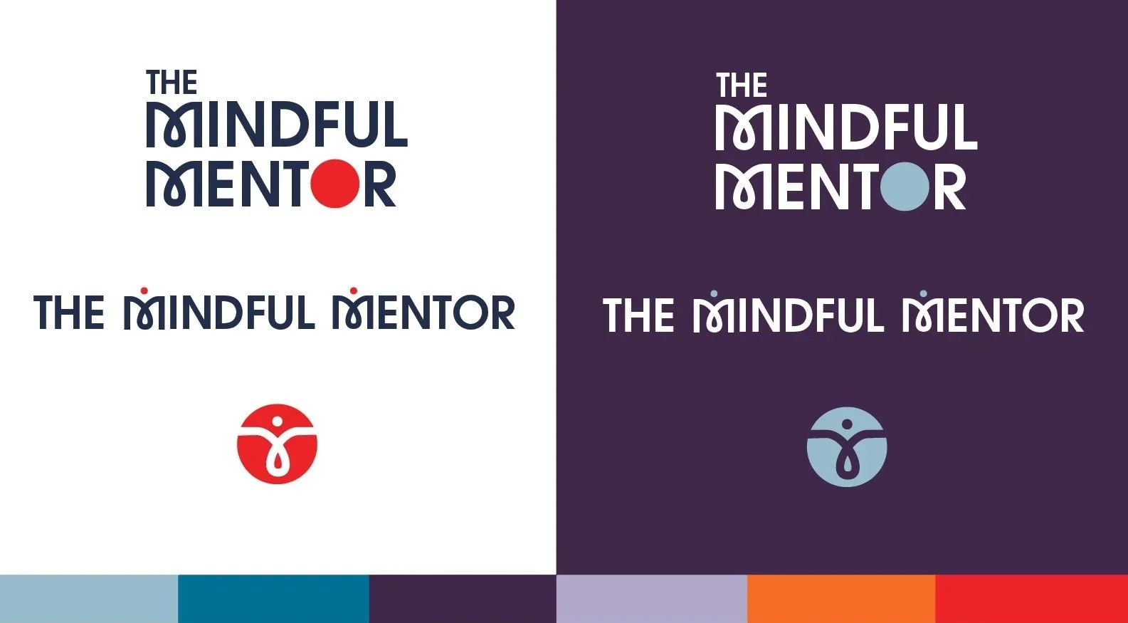
OPTION 2
A bold and modern sans-serif is met with a moment of playfulness in the loop of the M, without disrupting the overall mark. The filled O does double duty, nodding to the holistic approach at the core of the practice.
In the full lockup, two dots float above the M, rendered as abstract figures. The icon distills this further, zooming into the M until it reads as a single human form. Throughout, the letterforms carry a quiet softness, present and confident.
The palette brings the energy: purples add depth and a sense of intuition, while warmer tones bring an optimism. Blues anchor it all with trust and calm, a nod to the steady foundation offered to clients.
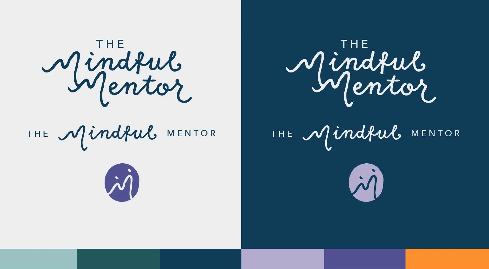
OPTION 3
A custom M unique to the brand, mirrors the distinctive offering The Mindful Mentor brings to the space of mentorship and coaching. The letterform doubles as the iconographic version of the logo, where two dots meet the M to abstractly represent an adult and a younger person — a simple but intentional nod to the mentorship relationship at the heart of the work.
A playful script pairs with a clean sans-serif, balancing the youthful energy of the audience with the professionalism and clarity clients can trust. The palette rounds it out with jewel-tone blues and greens, a soft lavender, and a warm pop of orange.
THE CHOSEN DIRECTION
The client was taken with direction 3, with a few refinements—a thinner script, a rework of the stacked mark, and a deeper, warm tone for contrast with an overall extended palette.
THE FINAL LOCKUPS:

THE FINAL PALETTE